How to communicate the abstract?

I’ve been exploring some of the ways that mood and emotion are expressed by different artists. To depict a ‘state of mind’ is slightly more complicated. It might take some background story or clues for the audience to understand a situation or how it has come about. Or perhaps a particular state of mind involves how an individual has chosen to respond to an emotion or an event; it is not just the emotion but the frame of reference and the individuals view. These more abstract concepts and complicated emotional narratives are much more difficult to communicate. I

I’ve been looking at the work of a few artists who deal with abstract concepts and convey them using different methods. Iranian textile artist Maryam Ashkanian , produced the pieces for ‘sleep series’ by embroidering the shapes and contours of sleeping people onto handmade pillowsThe concept of her work is almost entirely communicated through her choice of materials. The same images drawn on paper would just be the shape of people asleep, but by using fine threads to sew lines and quilt an indent or impression into the pillow, she creates a person who is there but also absent, away in a dream world. There is a vulnerability and fragility to her work ; those loose threads could be pulled and the person undone. The soft, plump pillows embody the comfort that can be found in dreams. In this way, it is the materials and method used to create her work which carries across the layers of conceptual meaning.

Ashkanian, M. (2014)
images from Sleep series

Another artist who uses the materials and the creation process to convey depth of meaning is Kumi Yamashita. Yamashita is a Japanese artist, living and working in New York. In SOMEONE ELSE’S MESS (1997) The emotion is immediate from the images of the doleful eyes and the sad faces of children. But it is not until we look closer at the materials and the method that the concept, the cause of the emotion and the situation giving rise to it is revealed. The images are made from military boot prints on bed linen, the boot prints are symbolic of being trampled upon, heavy footed, disregarded in the line of military intervention. The bed linen a reminder of their ordinary, intimate home life that is pervaded by the effects of war,violence and a military presence. The materials are not only symbols; the use of actual boot prints and actual bed linens to create this work brings an authenticity and a confronting, tangible sense of the reality of the experience they describe.

Yamashita, K. (1997) SOMEONE ELSE’S MESS

Some of Yamashita’s more recent work uses light and shadow to form images. In an interview for designboom, the artist explained

“For me, shadows came to symbolize another dimension of life, perhaps something even more real than its holder.

In the piece PATHWAY (2008)then, the silhouette of a man becomes the more powerful image than the aluminium frame. But it is the aluminium’s cutouts which define his contours. He is stepping out of the frame, but without it he wouldn’t exist. It raises questions about the relationship between the solid material and ephemeral shadow. Similarly in the piece BUILDING BLOCKS (2014) the question is raised, which is more important, the building blocks or the woman? The building blocks are solid definite objects and could be rebuilt to form any number of things. However we are drawn to the silhouette of the woman, despite her substance being less ‘real’ than the blocks. This perhaps suggests that material objects are not as important as people, despite the our temporary existences.

Yamashita, K. (2008). PATHWAY
Yamashita, K. BUILDING BLOCKS  (2014)

Conceptual illustration often uses more figurative or narrative methods to communicate difficult and abstract ideas. In the following images, Karolis Strautniekas creates a recognisable situation through figurative illustration, but also uses stylisation and abstraction to some extent, to simplify the background information and lead us through the narrative of each scene. Once we have an understanding of the situation, we become aware of the crux of the image, an element of disruption, often humour, which causes us to question and engage with the concept.

These pictorial narratives often have a much more immediate impact than a written explanation of the concept, and so are really effective in summarising the idea behind an article or theory and hooking our interest to understand more. I love the idea that in the future, technology will be so advanced that we will be able to live on Mars and have robots collect our dog poo, but that our ambitions will still be limited to being able to avoid simple domestic chores.

img_0342
Strautniekas, K. (2015) Understanding Our Irrationality
img_0346
Strautniekas, K. (2014) Europe’s and Austria’s power system

img_0343img_0344

Strautniekas, K. (2018) Illustrations of the future for Forbes Japan

The thing that conceptual illustration practice and the contemporary conceptual art installations and sculptures have in common is they require the audience to use it’s visual intelligence and comprehension to piece together an understanding. In this way conceptual artists and illustrators are able to communicate much more complex ideas than can be experienced as a purely emotional or aesthetic response.

sources

Ashkanian, M. (2014). Images from Sleep series. [image] Available at: https://www.thisiscolossal.com/2017/04/sleeping-people-embroidered-onto-handmade-pillows-by-maryam-ashkanian/ [Accessed 10 Dec. 2018].

designboom | architecture & design magazine. (2015). interview with artist kumi yamashita. [online] Available at: https://www.designboom.com/art/kumi-yamashita-interview-03-05-2015/ [Accessed 10 Dec. 2018].

Strautniekas, K. (2014). Europe’s and Austria’s power system. [image] Available at: http://strautniekas.com/#/datum/ [Accessed 11 Dec. 2018].

Strautniekas, K. (2018). Illustrations of the future for Forbes Japan. [image] Available at: http://strautniekas.com/#/forbesjp/ [Accessed 11 Dec. 2018].

Strautniekas, K. (2015). Understanding Our Irrationality. [image] Available at: http://strautniekas.com/#/forbes/ [Accessed 10 Dec. 2018].

Yamashita, K. (2014). BUILDING BLOCKS. [image] Available at: http://kumiyamashita.com/light-shadow/ [Accessed 10 Dec. 2018].

Yamashita, K. (2008). PATHWAY. [image] Available at: http://kumiyamashita.com/light-shadow/ [Accessed 10 Dec. 2018].

Yamashita, K. (1997). SOMEONE ELSE’S MESS. [image] Available at: http://kumiyamashita.com/portraits/ [Accessed 10 Dec. 2018].

Working in 3D: casting with resin

I thought I’d share the process of making this 3D model as the techniques are new to me but quite fun to try.

First I sculpted the shape of a bird using Fimo polymer clay and baked it in the oven to set.img_3407

Once it had cooled, I mixed silicone sealant with washing up liquid in a jug of water. I followed the instructions from this website,

https://www.instructables.com/id/Worlds-easiest-silicone-mold/

Take a look if you’d like to try yourself. It’s very easy to follow. I pressed the s silicon moulding putty around my bird shape and left it to set for a couple of hours. I then tried to cut the mould in half as cleanly as possible to release the clay bird.I made a hole in the mould where I wanted to fill from, and fed my somecoated wire LED lights through. I pressed the wire into the cavity and switched the lights on to check I had an even spread across the shape.img_3408img_3410Next I replaced the other half of the mould and used more silicone sealant to join the two half. I used a lollipop stick to spread the sealant evenly across both surfaces so that they would join well and not spill into the cavity. Once this was set, I mixed several colours of resin mix with the hardner according to the instructions. I used a pipette to fill the shape through the wire hole I had made earlier. I tried to fill the whole shape by moving the mould around and allowing gravity some time to settle the resin mix into the corners. When the mould was full I checked for leaks and added more sealant on any weak spots then left to cure, which takes around 24-48 hours.img_3411-2img_3412When he was set, I cut him free again from the mould. He looks pretty good- I’m happy that the colours had stayed in separate areas and not smudged together into brown. There were some weak spots on the wings where the resin hadn’t filled completely but I quite liked the texture. The only thing I would change is some of the edges were a little opaque. I think this was from the sealant used to join the two mould halves. So to avoid this, wi should’ve waited longer for the join to set. The only thing left to do was to dim the light and switch on the fairy lights…img_3442img_3439

Tada! The finished bird shining brightly.

The Lamplighter Festival

The Lamplighter Festival, in Todmorden is an annual event centring around a parade through the town centre and a series of light installations and performances. It began in 2012 as the Valley of Lights festival which was across three towns in the Calder Valley as a response to the terrible local floods which had caused so much damage to homes and businesses. The aim was to help bring the community together, boost moral and strengthen local businesses,. The event was a very popular innTodmorden and the organisers, Handmade Parade, decided to make it a recurring highlight of our calendar. Being local to the area, I have been every year and enjoyed it very much. This year was no exception, the weather held out and spirits were high! The only difference for me being this year, I arrived with my head still absorbed in my illustration project; I began to see the festivities in a new light! (excuse the pun)

img_3348-1img_3374img_3380

I noticed that a many of the large lanterns took the form of animals, and that the nature of the the animal seemed to have a symbolic meaning, particularly when lit up against the night sky. The stag- proud, fearless and protective with it’s domineering display of antlers. The lion- fiercely and defiantly roaring and waving it’s claws at the darkness. The fish, flowing through the night with ease and grace, lighting it’s own way.

I’ve been struggling to find a suitable way to represent the figure in one of my illustrations, perhaps using an animal form could add an extra layer of significance to the work?

img_3351
Defiantly happy coloured lights
img_3381
Lighting used to create a magical mood

I’ve really been thinking about the effect of lighting when expressing mood and emotion too, and the atmosphere of the whole parade was so infectiously cheerful, largely down to the contrast between the darkness and the bright lights. There was a whole mix of community spirit, optimism and creativity was all encapsulated in those lights.

Sources

http://handmadeparade.co.uk/lamplighter-festival/

The Lamplighter Festival (2018) [Exhibition] Todmorden town centre, 17th November

Using light and colour to create a sense of place

Caroline Walker paints scenes of women in their workplaces in the series SERVICE. The images all have a distinct atmosphere even though they are all set indoors, in the workplace, in artificial light with viewed from a darker outside. The different feel of each painting is largely because of the use of colour and light. In First Batch (2018) the Baker is bathed in warm light which evokes the cosy, comfort of warm bread early in the morning. Cut and Finish (2018) has a much brighter, almost clinical, light in the mirrored salon where surface image is important and there is nowhere to hide. Pattern Cutting (2018) has a calm, peaceful feel thanks to the potted plants catching the light. The abundant growth of the plants is bolstered by the deep green and royal blue material of the suits to the right of the picture, giving an overall impression of wealth, security and tradition. It feels like a work place where you could really focus and the figure does indeed seems absorbed in her task.img_0315

First Batch
Oil on board, 52 x 42cm
2018
img_0314
Cut and Finish Oil on linen, 180 x 240cm 2018
img_0024
Pattern Cutting Oil on linen, 165 x 240cm

I think it’s really interesting to study the subtle variations in the colours Walker mixes can make such a difference to the quality of light, the mood and, it follows, the meaning of each piece.

Sydney based artist, Nancy Liang has really used light, particularly moonlight, to create her own illustrated world, with a definite sense of place and mood, through her moving GIFs. A muted palette of craft paper cut outs and textures set against dark skies really evoke the eerily still crisp night air. In an interview for It’s Nice That, Liang explained;

“I love the night. There is something very beautiful about how quiet it is and I wonder about all the strange yet fascinating things that may transpire. I’ve always enjoyed how it felt, so much that it moved to me to make gifs to allow others to live the moment with me.

Liang, N. (2018)

The long cast shadows, small illuminated windows and signs and the bright cold yellow tones of the moonlight really create a specific atmosphere. I also love the crisp contrast across the light and shadows of the architecture, it feels distinctly moonlit and creates depth in a 2D cutout world.

Liang uses the GIF format to loop small flickering lights or drifting smoke; little details that only serve to emphasise how quiet and unpopulated the scenes are. I find this really fantastic, that such effort should be made to animate works only to prove how unanimated they are! The images work perfectly well as still images, but I encourage you to check out https://cargocollective.com/nliang to see the moving GIFs as, despite my amusement it really is effective, the stillness of the scenes are really brought to life.

Karolis Strautniekas uses a careful eye for colour in his illustrations to create a mood and a temperature, that is often part of the narrative of the image. In this poster for Honorific, the blue tones not only place us at night time, suggesting the figure has had a full schedule of work and/or play, but they also have a cool edge, giving the whole image a casual relaxed elegance which would appeal to the customers of the luxury gentlemen’s furniture brand. The piece Barcelona uses an entirely opposite colour range and effect. Where Honorific uses contrasting blue and yellow to emphasise the fresh cool evening, Barcelona uses only shades of the same red colours to illustrate the oppressive heat pouring in from the door; brighter red, on red, on red.

img_0347-1
Strautniekas, K. (2016)
img_0348
Strautniekas, K. (2018)

An illustrator whose work I really can’t get enough of at the moment is Jackson Joyce. He uses colour to really develop the sense of time, place and mood in his paintings. Joyce skilfully employs contrasting colours, subtle tones and clashing palettes to recreate and exaggerate the effects of light and create an almost tangible mood, or the nostalgic memory of it.

Joyce’s portrayal of colour-temperature and light show all the excellent qualities of observation and understanding of Walker’s work. He goes beyond any idea of realism though, with his simplified, stylised or exaggerated forms, and this allows him more freedom to play with colour. He pushes his theories and contrasts to an extreme which I think is what makes the images so expressive; Joyce finds the formula of light and shadow and colour to express a mood and then he concentrates the effect to really pack a nostalgic punch.

img_0223-1
Joyce, J. (2018)
img_0350
Joyce, J. (2018)

Sources

Green, J. (2016). Nancy Liang’s dreamlike visions of fictional cities. [online] It’s Nice That. Available at: https://www.itsnicethat.com/articles/nancy-liang-suburban-twilight-gifs-over-the-moon-080816 [Accessed 10 Dec. 2018].

Joyce, J., (2018), Image of a Boy and Dog [image]. Available at: https://www.jacksonedwardjoyce.com/2018/8/19/kvmvhc14kgyj3huw1oniuxn36cmb40 [Accessed 7 December 2018].

Joyce, J., (2018), Image of a Café Window [image]. Available at: https://www.jacksonedwardjoyce.com/2018/4/27/9n7kg9i5y9of515bopcu2sx92ywurg [Accessed 7 December 2018].

Liang, N. (2018). Old Spaces. [image] Available at: https://cargocollective.com/nliang/Old-Spaces [Accessed 10 Dec. 2018].

Liang, N. (2014). The Predicaments of Travelling. [image] Available at: https://cargocollective.com/nliang/The-Predicaments-of-Travelling [Accessed 10 Dec. 2018].

Strautniekas, K. (2018). Barcelona in August. [image] Available at: https://www.behance.net/gallery/70640983/Barcelona-in-August [Accessed 10 Dec. 2018].

Strautniekas, K. (2016). Poster for Honorific. [image] Available at: https://www.behance.net/gallery/32656921/Honorific [Accessed 10 Dec. 2018].

Walker, C. (2018). Cut and Finish. [image] Available at: http://www.carolinewalker.org/service.html [Accessed 10 Dec. 2018].

Walker, C. (2018). First Batch. [image] Available at: http://www.carolinewalker.org/service.html [Accessed 10 Dec. 2018].

Walker, C. (2018). Pattern Cutting. [image] Available at: http://www.carolinewalker.org/service.html [Accessed 10 Dec. 2018].

Mister Finch: The Wish Post exhibition

img_0352
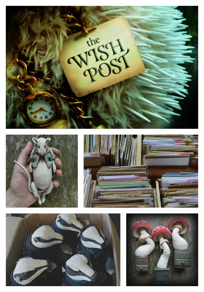
The Wish Post montage (2018)

In June, I had the absolute pleasure of seeing The Wish Post, an exhibition by Leeds based artist Mister Finch, at the Yorkshire Sculpture Park. I’d become aware of his work earlier in the year through social media and had been waiting with some anticipation to see his creations in the flesh ( by flesh, I mean padded and stitched cotton, of course). Finch Creates the most beautiful, charming fairytale creatures, and he had been keeping his growing number of Instagram followers updated with intriguing details, sneak previews, character backgrounds and progress pictures throughout the spring, so I was not at all surprised to hear that his opening night at the YSP was a sellout success. I was obviously not the only one who had been seduced by these wonderful characters!img_2546-1img_2548img_2545

Images above: Hedgehogs, Badgers and Mice
own photographs from Mister Finch: The Wish Post (2018) [Exhibition]

Mister Finch is self taught, and sews and makes all of his sculptures himself by hand. This must take hours, but shows that Finch really does create for the love of it. It also means that by the time Finch has made a creature he already has a relationship with it; it’s stitches tell a story and the character and narrative have already begun. The use of collected, recycled and reused materials and objects also add to the sense of story each object has. The badges on the Post Badger’s jackets are made from collectible spoons, and Mister Finch often repurposes fabric and embroidered textiles. He says on his website;

“It’s a joy to hunt for things for my work…the lost, found and forgotten all have places in what I make. Most of my pieces use recycled materials, not only as an ethical statement, but I believe they add more authenticity and charm. A story sewn in, woven in. Velvet curtains from an old hotel, a threadbare wedding dress and a vintage apron become birds and beasts, looking for new owners and adventures to have.
Storytelling creatures for people who are also a little lost, found and forgotten…”

Looking at his creations in the gallery, I could certainly feel sense of a past life through the materials used, even without hearing any backstory. There is a past life imbued in the objects and the artists choice of materials, textures and creative method really do make a magical and believable world. The editor of US Wallpaper, Michael Reynolds put it well when he described Finch’s 2015 exhibition;

“He seems to have imagined quite a fantastic other reality, populated it, foraged it and has been good enough to share its spoils with us.”

The characters that Mister Finch creates do not only exist in gallery exhibitions however. They have become so real that it feels they now exist in the world. Seeing them photographed outside the gallery, in the countryside seems entirely natural.

Badgers outdoors (2018)

How marvellous then that Mister Finch also decided to publish a photo story book, titled ‘The Wish Post’ alongside this exhibition! The first part of the book is the tale of the Wish Post. The introduction has a brief explanation of the characters and their tradition of the Wish Post. After that, the story is told entirely in images, beautiful photographs which illustrate the journey of one little mouse to make it’s Wish.

Page from The Wish Post book (2018)

The second part of the book contains fantastic ‘behind the scenes’ images and descriptions of the different characters, their creation and their roles in the invented world of the artists making. It’s a real treasure to own.

Mister Finch is an artist I admire because of his skill and the beautiful pieces he makes. But he is also at the fore of contemporary practice, modelling new methods of promotion using social media, self publishing and merchandising. He makes his art accessible and affordable to ordinary people and is not trying particularly to please the critics, but rather has found his audience who connect with the work that his heart has led him to.

He told Sharon Dale of the Yorkshire Evening Post:

“My ambition was to work from home doing what I love, sell my pieces and be secretive and now I do and I am so happy. My dream has come true and its really all thanks to internet and social media.”

Sources

The Wish Post montage. (2018). [image] Available at: http://ohmisterfinch.tumblr.com/post/174538995594/huge-huge-huge-smiles-okay-you-can-now-pre-order/amp [Accessed 10 Dec. 2018].

Badgers outdoors. (2018). [image] Available at: http://ohmisterfinch.tumblr.com/post/165860092034/ive-got-a-news-of-a-show-next-yearim-super-duper [Accessed 10 Dec. 2018].

Page from The Wish Post book. (2018). [image] Available at: http://ohmisterfinch.tumblr.com/post/174947543669/this-is-a-page-from-the-bookits-one-of-my [Accessed 10 Dec. 2018].

Mister Finch: The Wish Post (2018) [Exhibition] Yorkshire Sculpture Park, West Bretton 23 Jun–23 Sep 2018

Ysp.org.uk. (2018). Mister Finch: The Wish Post. [online] Available at: https://ysp.org.uk/exhibitions/mister-finch-the-wish-post [Accessed 10 Dec. 2018].

Mister-finch.com. (2018). About | Mister Finch. [online] Available at: http://www.mister-finch.com/about/ [Accessed 10 Dec. 2018].

Wallpaper (2018). Mister Finch opens The Holiday Pop-Up Shop in NYC’s Steven Kasher Gallery. [online] Wallpaper*. Available at: https://www.wallpaper.com/art/mister-finch-launches-holiday-pop-up-shop-at-steven-kasher-gallery-nyc [Accessed 10 Dec. 2018].

Dale, S. (2018). Hare today, gone tomorrow: The age of the internet artist. [online] Yorkshirepost.co.uk. Available at: https://www.yorkshirepost.co.uk/what-s-on/exhibitions/hare-today-gone-tomorrow-the-age-of-the-internet-artist-1-8174661 [Accessed 10 Dec. 2018].

Expression through the quality of ink brush marks

I was reading Meggs History of Graphic Design, and the section on the Asian Contribution was interested to read his description of the qualities communicated through the brushwork of calligraphy.

“Spiritual states and deep feelings can be expressed in calligraphy. Thick, Languid strokes become mournful, and poems written in celebration of spring have a light exuberance.”

Meggs goes on to say;

“Calligraphy was said to have bones (authority and size), meat (the proportion of the characters), blood (the texture of the fluid ink), and muscle (spirit and vital force)” Meggs, p39

I am interested in the idea that you can capture more than just the resemblance or physical appearance in a drawing or painting. Many of the concepts i’d like to illustrate  are abstract, so the idea that variation in brushstrokes can communicate, energy, movement, mood and emotion is fascinating to me.

I read a study by Hue about the links between spiritual expression and Chinese Calligraphy.  It was interesting to read that the practice of calligraphy can be a means for meditation or mindfulness and that the very best Chinese callligraphers were respected as talented artists. Hue gives a great overview of theorists and writings that would be inaccessible to me otherwise, being rarely in published in English, and this provided some exciting insights for me into the qualities of the calligraphers brushstrokes.

“Wei Shou (272-394 AD) stated in The Illumination of the Brush that individual strokes were classified into six types. Each of them must evoke the following qualities of Nature:
The horizontal stroke is likened to a narrow cloud stretching across the sky; the dot is like a stone dropped from a high peak which hits the ground with a sharp retort; the left slash is as bold as a rhinoceros horn; the right slash is an arrow ready to leave the taut bow string; the horizontal turning hook is like the bow itself, pulled to its farthest position; and the diagonal hook is like the crashing of an incoming ocean breaker.” Hue, p27

This is the kind of thing that I can’t read without having a go at myself, not to create perfect examples but just to understand better the description of the strokes. So for your amusement and delight I have included an image of my inky explorations, using Chinese brushes and drawing ink.

C9BF7061-D8C3-46CF-BC11-9069672E8C63

I’m sure that my strokes below the standard of a Chinese pre-schooler, but I do thinkthat through this I’ve gained a better understanding of reading works of Calligraphy as pieces of art and by extension, Chinese paintings too. It’s interesting to me that the strokes and elements described by Wei Shou as being ‘natural’ perhaps reflected some of the extreme landscape and scenery of China and Japan, bringing to mind dramatic mountains and waterfalls ranging to gentle curving rivers and flatlands, great waves and even the volcanoes and tsunamis which I know resonates within Japanese culture. I wonder if he would have found the same vitality in calligraphy had he been living in Yorkshire, England. Perhaps my own artistic marks hold qualities of this landscape within them?  I shall keep an eye out for reflections of cobbles, craggs, moorlands and valleys in my work.

I also tried to ink my way through some of the theories of Zhang Yinlin, who stated:

“Horizontal lines convey a feeling of repose, of quiet…vertical lines, of solemnity, dignity, aspiration…crooked lines of conflict and activity…while curved lines have always been recognized as soft and voluptuous and tender.” Yinlin, p21

These are qualities that are easy to apply more generally across all image making mediums,I think. I have instinctively used horizontal lines to create a calm ‘space’ on the page before in my work; in fact it became a theme in sketchbooks and my art works.

Yinlin’s Words also reminded me of the animated works of Oskar Fischinger, who made marks on film to visually interpret music. In study number 7, the lines stretch and curve in a way that shows not just the length of the note or the pitch, but expresses something of the ‘feel’ of the sound. You can see a short clip here;

Study no. 7 by Oskar Fischinger from CVM on Vimeo.

According to Adrian Searle writing in the Guardian, even though Fischinger’s work was pioneering, this form of expression was so instinctively easy to interpret that his abstract films were extremely popular with the general public and were shown alongside newsreels in the cinema during the 1930’s. Searle writes;

“Who says the general public can’t get abstract art, or couldn’t get it even back when the word avant-garde really meant something? So long as little shapes swooped or trembled or danced to music, they seemed to have purpose and meaning. Fischinger never tried to illustrate music, but to provide a visual equivalent.”

I decided to try the inks again, but this time to paint the same subject but whilst listening to different music. I tried not to consciously control my marks to reflect the music (although I probably did), rather I wanted to see if the music influenced the action of my painting and changed the qualities of the brushstrokes.

0CFB4314-B5BE-4E30-95D7-B837F0DD287C

In general, I think something of the music has come across. Can you match them up correctly? Personally, I feel that the loose, relaxed curves of image 1 reflect the chilled, happy reggae of the Maytals. The second image, I like a lot less, but I think shows the anxiety from the crooked lines as being conflicted, as Yinlin described them. Perhaps I like the image less because of this conflict and chaos; it doesn’t sit as easily, but that is also what makes it communicate the emotion of the music well? Image 3 I love, for it’s delicacy and strength and all the nuances between, but then Björk is also my favourite musician! Image 4 I think has something of the dark, deep sounds of hip hop and I like the weight of the lines and something about the bleed of the ink onto wet seems apt. Finally, image number 5 I would count as the least successful and most confusing! Leonard Cohen fared poorly.

It’s been interesting to compare the quick instinctive response to music to the carefully composed practice of Chinese Calligraphy, which according to Hue takes years of practice and meditative concentration in order to achieve a true reflection of the calligraphers spiritual self. Fischinger’s practice was similar to the calligrapher, in that his work was carefully composed and hand drawn frame by frame, so that what is seen fleetingly by the audience has been hours in thought, composition and production by the artist. I will take these contemplations away and see how I can use them to improve the expressive impact of my work, other than to stop trying to draw to Leonard Cohen, who is apparently just too much for me, although I love his music.

Meggs, P.B and Purvis A.W. (2016) Meggs History of Graphic Design 6th edition, John Wiley and Sons

Hue, M. T. (2010) Aestheticism and Spiritualism: A Narrative Study of the Exploration of Self through the Practice of Chinese Calligraphy The Journal of Aesthetic Education, Vol. 44, No. 2, University of Illinois Press

Yinlin, Z. Zhang Yinlin: A Preface to Chinese Calligraphy Criticism (1931) Xiongbo, S. Journal of Art Historiography 4; Glasgow Iss. 13,  (Dec 2015): 1-29.

http://vimeo.com/user4392897/vod_pages

http://www.centerforvisualmusic.org/Fischinger/

https://www.theguardian.com/artanddesign/2013/jan/09/oskar-fischinger-animation-disney-nazis

What’s the opposite of being in a shit state of mind? I want to draw that!

I’m thinking about depicting or expressing states of mind, and having a little look around there’s a wealth of artistic interpretations of depression, anger and anxiety. I started to wonder, what’s the other end of the range? I came across this TED talk by Mihaly Csikszentmihalyi about the state of optimal flow.

I’ve posted it here, because really the idea is so interesting, it’s a great talk- but it’s quite long so to summarise briefly the idea is that happiness can be achieved through “flow” — a state of heightened focus and immersion in activities such as art, play and work. To achieve optimal flow, the theory goes, we must have both a high level of challenge and a high level of skill to be able to respond to the challenge. This, I felt, was a particularly interesting state to be in and I wondered how you could represent it visually. I started looking around for artists and images which captured something of the state of flow.

C322306B-B797-4374-84C3-C468CFBE6520

Artists credits:

top from left to right- Clara Lieu, Steve Cutts, Stanley Spencer, Ryohei Yamashita, Dragon 76, Anne Faith Nicholls, Hisakata Hiroyuki.

2nd row- Jackson Joyce, Koya Okada, Dan Lish, Ernie Barnes, Jan Masny, Caroline Walker.

3rd row- Steve Cutts, Ernie Barnes, Ryohei Yamashita, Ernie Barnes, Ernie Barnes.

bottom- Steve Cutts, Jackson Joyce, Gwen John, Gwen John, ?? , Ernie Barnes, Ernie Barnes.

I found images across a whole spectrum of activity, and tried to match them up to the graph Csikszentmihalyi uses to explain the state of flow.

87283EA6-9405-4848-95FD-0F98ACA9BB4D

Which I then laid over the images so I could see the correlation.

A00E4680-305B-481F-8912-F2C3C03620AD

I found this a really interesting exercise to explore the more complex nuances of peoples states of mind. It also made me question how they are portrayed visually and is great to keep looking at for inspiration and to notice the elements of visual language we use to communicate abstract emotional states and states of mind.

For instance, the top left images of anxiety and worry have similar angles in them, a right tilted L shape, a composition that creates an unnerving, unsettled feeling. The images in the upper middle of arousal are all very busy and full of movement.  The images in the top right area showing flow and control all contain figures with controlled, deliberate posture.

There are also some patterns to be noticed within the colours used. Worry and anxiety seems to use red and green complementary colours for maximum contrast. Boredom favours a neutral palette, and relaxation a harmony of natural greens and blues. Again, the upper section of arousal is a busy clash of all different vibrant colours.

It might be an interesting diagram to come back to with my finished images from my practice module, to see where I would place them and how they fit into these patterns.

Images from my FAT1 practice module.

http://www.ted.com/talks/mihaly_csikszentmihalyi_on_flow?language=en&utm_campaign=tedspread&utm_medium=referral&utm_source=tedcomshare

‘The Plunge’ by Anne Faith Nicholls

Anne Faith Nicholls is an American contemporary artist based in California. Best recognized for her Neosurrealistic paintings, Nicholls has exhibited in collections, galleries, museums and fairs around the world, and also contributed to a variety of high profile commercial projects with renowned collaborators. Often exploring the subconcious, her works are layered and mysterious, creating symbolic and alluring narratives on the human condition, with a unique perspective. 

http://www.annefaithnichollsart.com/about/

I found this image as I was looking for illustrations which showed a character with a high level of focus, or depicted in the ‘state of flow’. I realised that by unravelling my reaction to this work, that I could learn a lot about expressing emotional states and state of mind from this artist.

http://www.escapeintolife.com/artist-watch/anne-faith-nicholls/

My thoughts are that the symbols in the piece loosely translate as;

stormy weather- difficulties, problems, dark clouds hovering, worries

Rain- tears, upset, release of emotion

The hand- fate, a higher power, good fortune

Lighthouse and dawn sun rays- hope, optimism, guidance and support

Dark waters- unknown experiences, deep feelings.

The woman turns her back on all these things. She is focussed, determined and prepared. she is making herself brave, having contemplated all of these emotions and circumstances whilst walking along the diving board, the perspective of which makes it seem like it was a long journey. There is tension as her body is held for that moment of potential energy before she dives. Her eyes are open, her gaze lifted and fixed on her goal off to the left of the image. Having her on the left, looking left also creates tension and uncertainty. Diagonals in bottom right create dynamic tension, as do the lightning shards

Her main environment has depth: the central ‘bubble’ in which she is standing has a foreground, perspective and very distant horizon. However, all the other images are framed in circles, perhaps thought bubbles, which are at the same foreground level of the figure. It feels that the thoughts are pressing into her space and there is an overwhelming chaos around her. It demands our attention, which otherwise would immediately follow her gaze off to the left and out of the frame. Instead we are drawn back into and away from centre, highlighting again the tension caused by ‘capturing’ this moment when the figure is poised ready to dive and holding it indefinitely.

The more I look at this image the stronger my feelings become; it is so effective at building an emotional tension and empathy that I am unnerved, almost uncomfortable. And yet I have to look at the image again, in the hope that something will be resolved. In the end, we are left in the same position as the figure, who does not know what her future will be but must rely on optimism, that her faith determination and preparedness will lead her to a positive outcome.

Steve Cutts: Breaking away to find happiness

I saw this film last year and recently stumbled across it again. As I became engrossed in the short film the second time around, I realised what an impact this film had had on my thoughts over the last year and how inspirational I still found it.


<p>
<a href=”https://vimeo.com/244405542″>Happiness</a&gt; from <a href=”https://vimeo.com/user4630714″>Steve Cutts</a> on <a href=”https://vimeo.com”>Vimeo</a&gt;.</p>

‘Happiness’ is a caustic exploration of capitalism, commercialism and consumer society. The animated short has reached a wide audience across digital platforms and has been showing in film festivals over the summer, winning two prizes and catching the eye of Ridley Scott, the legendary director. Scott selected it as one of the top 5 most inspiring short films during the Cannes Lions festival, which he was curating this year.

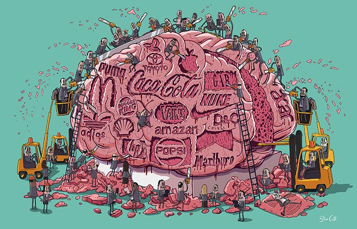
Steve Cutts worked for a London design company for 4 years,  creating work for accounts with big brands like Coca Cola and Sony, before making the break to go freelance in 2012. Much of his work is critical of the the same consumerism and advertising which is prime pasture for designers.

23297587-5F3E-47A3-905E-4A1510281FE4

Where once your the attitude of your work was prescribed by your client’s brief, by established conventions and by the temperament of contemporary practice; Perhaps it is possible in the current climate to be a successful designer or illustrator with an independent voice? How have the parameters changed and why? This is something i’m keen to research further.

Aside from it’s positioning in the current marketplace, Cutts’ work interests and intrigues me because of it’s competent narration of complicated ideas. The keyword I am using as a starting point for my research is ‘state’. I’ve been thinking about the state as a governing system, emotional states and people’s state of mind. Steve Cutts work often shines a light the state of society. He also creates very relatable characters with whom we can instantly identify and empathise… so that as the depths of their situation and emotions are revealed we feel it all the more sharply.

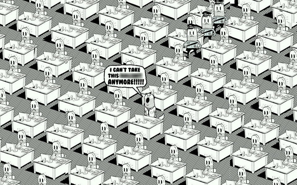
1156E9D4-A896-436C-9CD7-D250E6A0E275

In this piece, the narrative unfolds within a single still image as the composition leads around the illustration. First we notice the pattern and uniformity, then the multiple unhappy faces before our eye is taken by the distraction in the centre. We can see his pained outburst in the little guys expression and his body language, and it’s confirmed by his words in bold caps in the speech bubble. He’s swearing and furious and he’s defiantly refusing to continue. We think… “ I feel your frustration, i’ve been there too!” and we cheer him on as he takes a stand. But then as we’re left to ponder what changes the guy will make in his new bid for freedom, we notice to the top left some different characters headed back along the canvas towards him. More clones, but this time with authority and menacing truncheons. We’re gutted for him. We’re gutted for ourselves. For a minute we contemplated a different system and raised our hopes only to drill home the point that he is trapped and the little guy cannot win.

I think that is an incredible amount of conceptual detail, storytelling and emotional engagement from a single black and white image.

As the youngsters would say, #goals.

http://www.stevecutts.com/

http://www.postfactory.co.uk/awards-for-happiness-steve-cutts/

http://nowthenmagazine.com/sheffield/issue-93/steve-cutts/

https://www.huffingtonpost.co.uk/entry/steve-cutts-modern-society-illustrations_us_55e61ea3e4b0aec9f365502e2

https://www.adweek.com/creativity/the-5-most-inspiring-short-films-at-the-cannes-new-directors-showcase-curated-by-ridley-scott/

https://www.webbyawards.com/winners/2018/film-video/general/animation/happiness/


State.

The keyword I’ve chosen to base my research and development around is ‘state’. This blog is intended to be a place to collate all my research and explorations, and also to reflect back on the journey. So here we are at the start, highlighters ready, diving in… let’s see where this takes us!

7D69F92F-E09A-4A6E-882F-C37F1895C140

Image taken from FAT1 practice, my keyword starting point.

Good company in a journey makes the way seem shorter. — Izaak Walton